Portfolio
VISUAL COMMUNICATION DESIGN | LOS ANGELES
ANASTASIYA.N.BRAILKO@GMAIL.COM


01
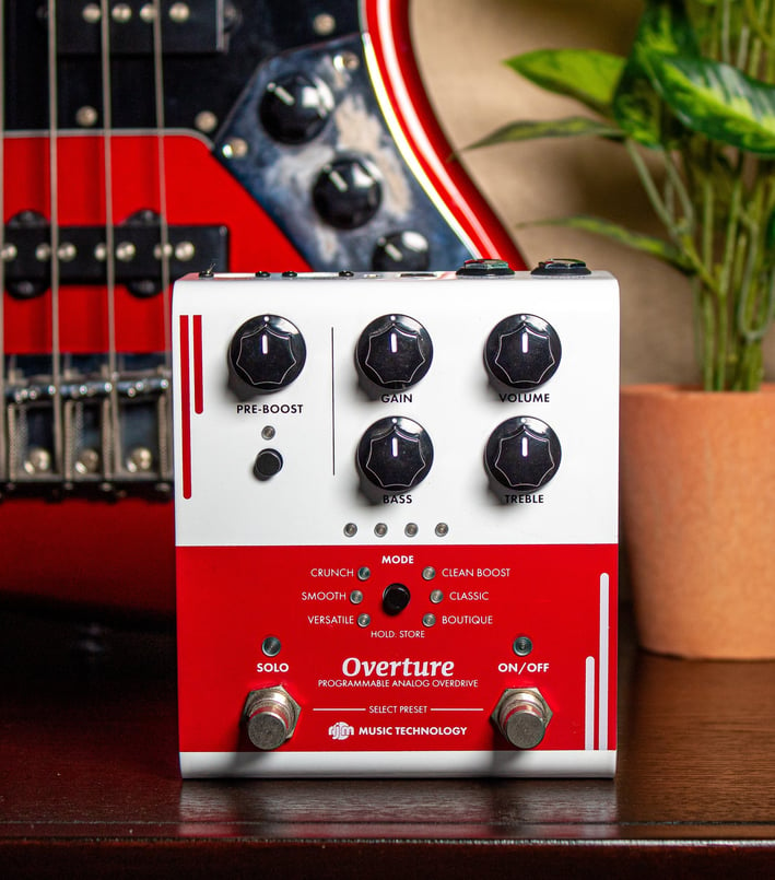
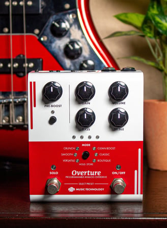
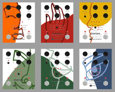
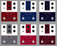
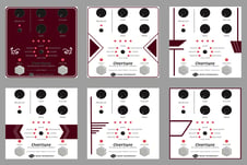
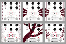
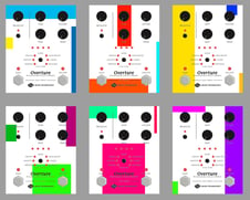
Overture Guitar Pedal for RJM Music Technology
This graphic is a freelance project for the company RJM Music Technology. Guitar players are known to be hash critics of guitar pedals that aren’t plain black. However, RJM wanted their pedal to stand out, so that it can be easily recognized when shown on television broadcasts. For that reason, the challenge was to create a simple geometric design for the front of this pedal using only red on a white base.
Process
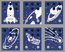
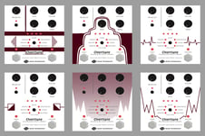
At first, I was tasked with figuring out the direction that RJM wanted to go. This was the first time they would be putting out a product with an artistic design so they were unsure what kind of design they were looking for at first. After doing some research into what was already out there, I came up with a wide variety of designs to see what the client would gravitate to. RJM decided on a maroon red color with a white base and a geometric design. They wanted to keep it simple for the first pedal as guitar players are quite picky. With that decided I made a few more design ideas until we settled on a half and half design with some line elements. To the left are the sketches presented to the client.
02
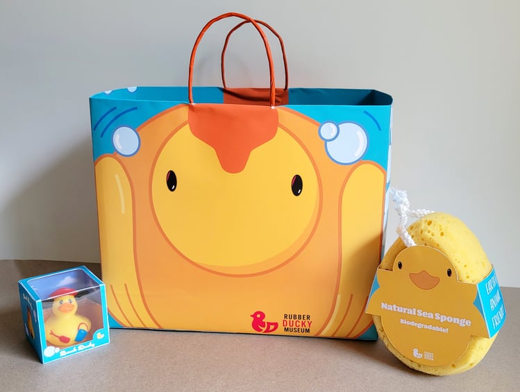
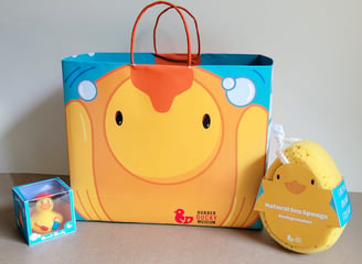
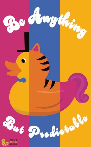

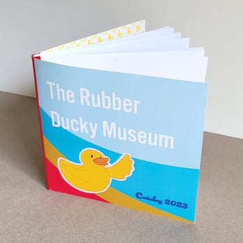


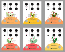
The Rubber Ducky Museum
This fictitious museum was created for a print class with a focus on designing branding and packaging. This fictitious museum would be set in Los Angeles, California as a sightseeing destination and gathering place, consisting of exhibitions of various rubber duck designs, as well as a giftshop. It has a fun, vibrant, and wacky atmosphere, encouraging individuality and authenticity. While not directly marketed towards children, the museum is family friendly.


03


A Sip Of Color Recipe Book
A Sip Of Color is a drink recipe book created as a collaborative assignment for typography class. The class was divided into smaller teams, with each responsible for creating a recipe spread for their assigned drink color.
I worked on the Glamorous Greens section along with Soobin Lee, Luis Oropeza, and Celine Park. I did all of the photography and contributed to the composition of our section. My design was also chosen by the class to be used for the book's index. We each created our own cover page for our individual copies of the book.
04
Animated Music Video Short
This animation is a 34 second long music video created for a final project for a motion graphics class. The challenge of the project was to animate to the rhythm of music. The elements on screen move to the beat of the song “Test Me“ by Xdinary Heroes. This project was created using key framing, frame by frame animation, and motion tracking, compiled in After Effects.
05
What Will You Create? Animated Poster for Mall Display
This animated poster was designed as a final project for a typography class. It is a looping video where the 3D modeled and textured word “Create“ spins on the y-axis and changes form on every rotation. This poster is intended to be shown on a large, freestanding digital display inside of a mall. The word “Create“ was 3D modelled, textured, and animated using Blender. The final composition was created using After Effects.
06
Product Photography
This is a product photography assignment which showcases skills in lighting, staging, and photo manipulation. These photographs are intended to be used as advertising material for print and web applications. The goal was to make the product look appetizing to potential consumers, as a snack that pairs well with tea and coffee.
The assignment required the use of an existing product. Pepperidge Farm is not affiliated with this project nor the university.


07
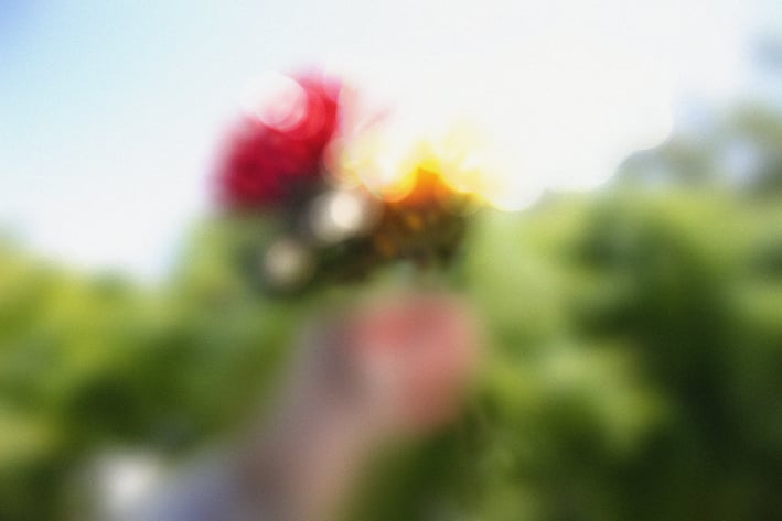
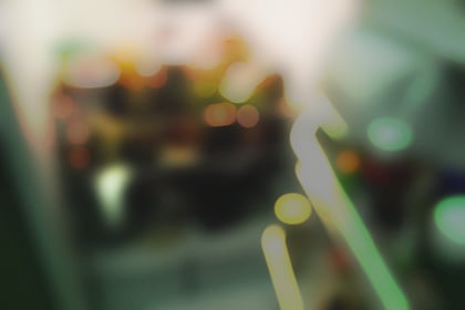
Photography inspired by Barth
These photos are a study and appreciation of a body of work by the photographer Uta Barth, who explores the ephemeral qualities of how the human eye takes in light through intentional blurriness.
The first image depicts a hand holding flowers which anyone would find beautiful. In contrast, the second image is of the inside of a fridge at night. The way the light plays off of the food items is beautiful but you would only notice if you were specifically looking for its beauty, which the unfocused image helps the viewer to partake in.

08
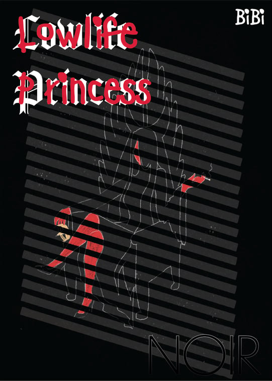
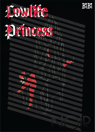
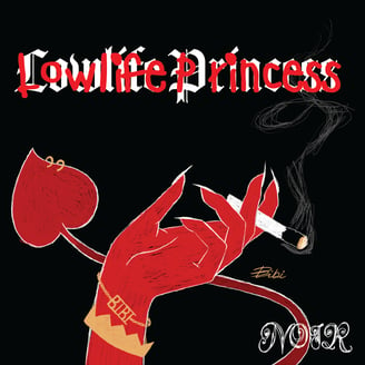
Lowlife Princess Album Redesign
This is a project for a print class which takes an existing music album and completely changing the design and art direction. This album is by the artist Bibi, with the original design utilizing a lot of photography and sexual imagery. In my redesign, I used illustration, typography, and symbolism to convey a deeper degenerate aesthetic which has more of a rebelious rather than sexual connitation. This project consists of a three color poster for risograph, an album cover, and a sticker.


09
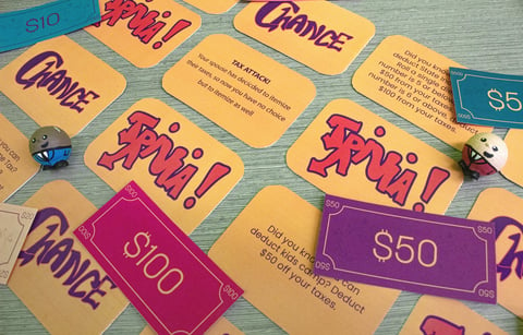
Learn by Playing: Tax Attack Board Game
Objective: Create a game board with the topic "Tax Attack". The design team is responsible from content research, all visual components to final game mock-up. The goal is to educate the audience through playing the game.
Dimensions: Game 20" x 20"; Box 10.25" x 10.25" x 2.6; Cards 3" x 2"; Money 3" x 1.5"; Player Pieces 20mm
Team Designers:
Sophia Alcaraz- Color and Illustrations on the game board. Chance cards.
Diana Barrera- 3D modeled player pieces and box.
Liam Bolinger- Vectorized hero image and instruction sheet.
Anastasiya Brailko- Wrote the trivia and chance cards. Created game rules. Outline and structure of game board. Game money.
Jacob Chaves- Trivia cards.
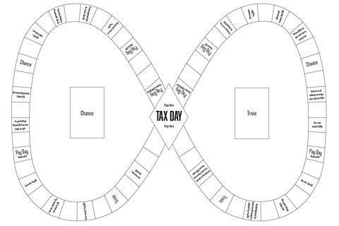
Design Process: We began by brainstorming ideas of how a game centered around educating the public on the differences between standardized and itemized taxes should work. We decided on the concept of having a "Tax Day" space where players would stop and have to pay their taxes. They could choose between paying standardized or itemized taxes depending on which chance and trivia cards they picked up on that round. The game continues until everyone but one player loses all their money. The player remaining wins. From there I wrote up the chance and trivia cards with the input of my team members. Then I designed the outline of the game board. Image below:
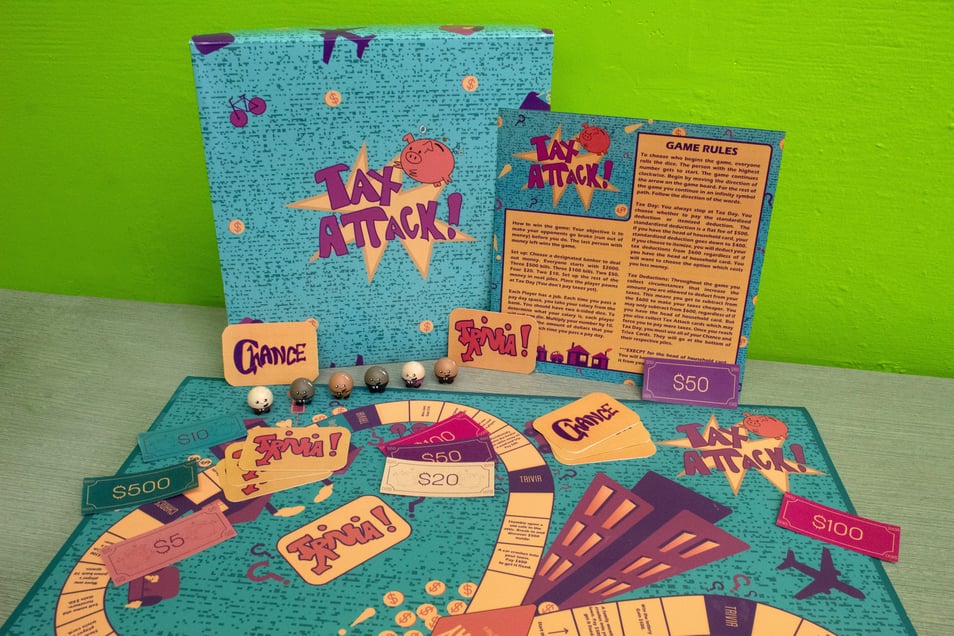
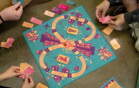
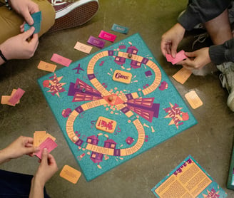
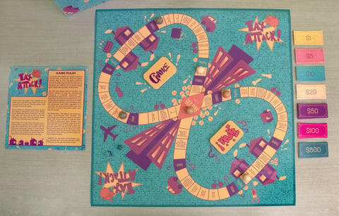

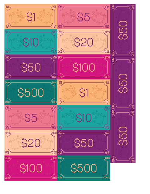

I then sent it off to Sophia for color and illustrations. My team members created the rest of the game elements while I created the game money, shown to the right. Once everything was complete I went to the print shop, printed and constructed everything for a test run of the game. After a few people had a chance to play it, my team and I made changes based on the feedback. I rewrote some of the game board tiles, cards, and changed the rules. My team members updated their parts to reflect the changes. Then I reprinted and constructed the final game. The player pieces were 3D printed and painted by Diana. She also constructed and designed the box.
10
Quad App Design
This is a project for a UX UI Design class made using Figma. This is an app designed for students to easily make friends and find community on campus. There is an ID verification system to ensure that every user is a student at that specific university. Quad features an explore page which houses majors, topics, and groups. Within these three categories are sub-groups. This means that a student can select their major to see posts and profiles of other students in the same major as they are and connect through study groups and interests. All majors are visible, however only students with that major selected on their profile can post in that major page. Each user has a profile in which they can post both text and photo posts, answer prompts, and express their personality. Even if there are no clubs on campus which a student is interested in, they will still be able to find like-minded peers on the app.

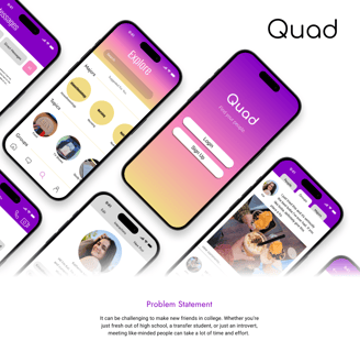
Check out the full presentation here!
11
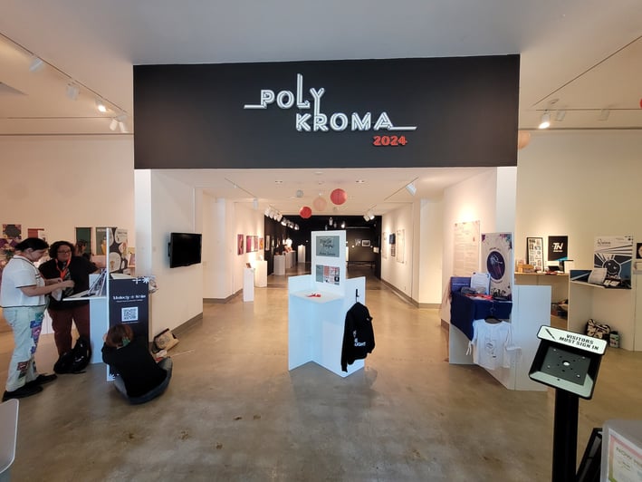
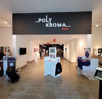
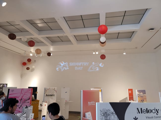
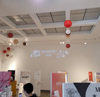
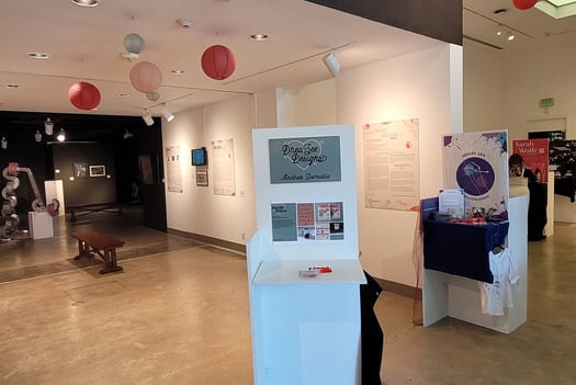
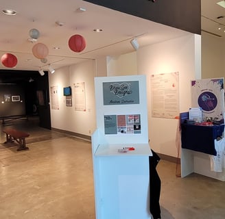
Poly Kroma 2024 Event
Poly Kroma is a multi-day event consisting of three shows that celebrate Visual Communication Design within the art department at Cal Poly Pomona. The two main events are the 2D3D+ exhibition (a juried gallery event for art and design works) and Industry Day Portfolio Showcase (a senior portfolio showcase attended by industry professionals). In 2024, one more event was added called the Motion Festival which showcased motion graphics on a large screen.
I had the honor of working on the Poly Kroma team to make these events happen. My main contributions include all of the digital advertising on screens inside of the library and ENV center, including the 5 marquees around campus. I also created the large text panels and the motion projection inside the gallery. All of which is pictured here.
In addition my animation "Bothered Cat" was selected to be shown in the motion festival. View the animation here.
Marquee animation


Text Panels : Click for full screen
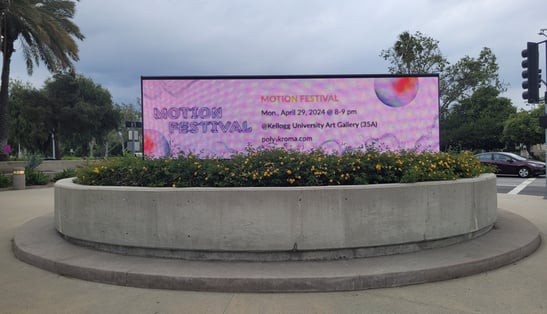
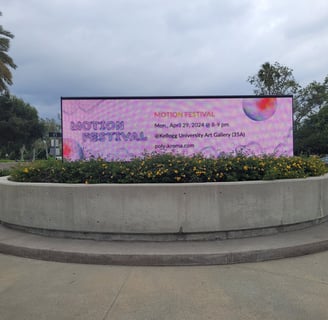
Photo of Marquee
This is the motion graphic projected onto the wall of the gallery
This is a photo of the large text panels on the walls
12
Power Point Demo Reel
This video was made using PowerPoint in order to showcase my level of proficiency and skills when it comes to presentation design. This presentation includes animations made in After Effects, as well as PowerPoint native animation tools. There is also an interactive feature at the end which will replay the entire presentation when clicked.


